

SENSORIUM EMPORIUM
Parent-created, kid-approved sensory toys and items
I had the opportunity to create everything from the fun and playful logo to the eye-catching packaging, ensuring it all resonated with both parents and kids alike. I also art directed photoshoots, designed e-commerce assets, and created whimsical illustrations to capture the imaginative essence of this sensory-focused brand.
My Role:
Branding, Art Direction, Illustration, Packaging, Graphic Design
Client:
Sensorium Emporium / Cupboard
Photographer:
Andrew Cebulka
Year:
2021


Imagining the possibilities
The team at Cupboard created a detailed brief and mood board for me to draw inspiration from, including some sample illustrations and the target demographic of millennial parents shopping for their age 3+ children. The brand adjectives for Sensorium Emporium were: imaginative, educational, whimsical, curious, lively, joyful, fun, and reliable.
I began by sketching some characters that spoke to that personality and incorporated the requested imagery of mermaids, clouds, rainbows, and unicorns, as well as some more abstract ideas that played off of the concept of “imagination”. We landed on the selected character, since it spoke well to the imaginative nature of the sensory toys and was gender-neutral.
Moodboard Artwork by: Eight Hour Day & Red Fries


Character rough sketches

Progression from sketch to full lockup
Bringing Sensorium Emporium to life
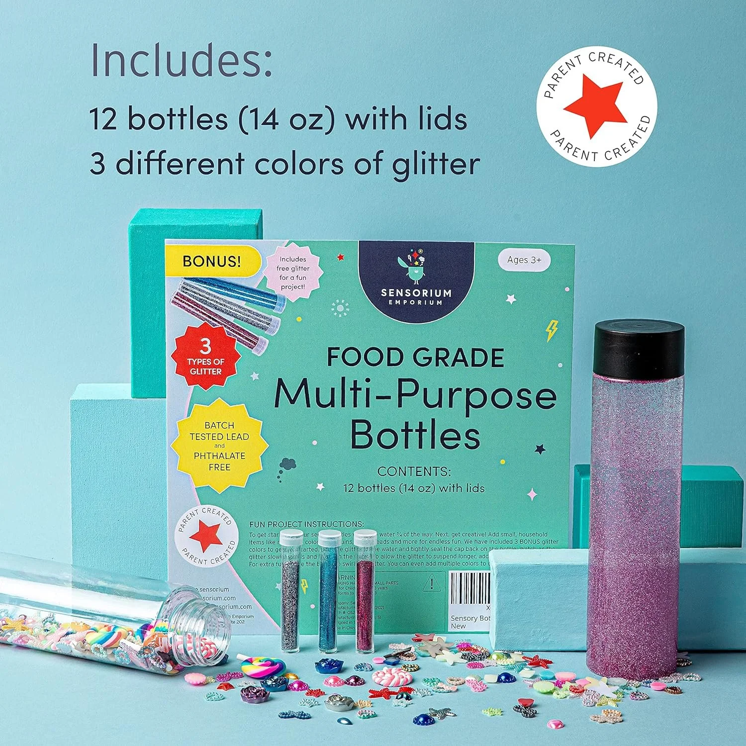
Once the branding was established I got to work on designing packaging for various products, as well as conceptualizing and art directing photoshoots for lifestyle and studio photography that we could use in e-commerce assets. I drew illustrations that could be used in both print and digital applications, creating a playful and cohesive look.


Amazon assets for selected Sensorium Emporium products:


Selected Amazon A+ Content assets:

